The Block in #Blocktober
As some of the Tweeters among you will know, this month is #Blocktober on Twitter. It’s a recent addition to the social media calendar that sees game devs showing off their pre-arted work, sometimes lovingly referred to as grey-box or white-box environments.
Earlier in the week we shared the above GIF as an example of how our teaser trailer evolved from our own grey-box art, so for this week’s blog we thought it would be good to shine a light on this process and some of the things we look to establish early on.
Quick iteration The key to a good grey-box is speed. It should be something you can create and get running in engine as quickly as possible, so no high poly modelling or lighting/colour passes. Think of it as a sketch to be detailed in later if it looks as though it’s going to be good!
Level layout This sounds kind of obvious, but until you get into 3d, you don’t know how navigating your environment is going to feel spatially. For example, how does the player enter the scene, how long does it take them to traverse, what can he or she see, are key objects visible, etc? All of these elements have an impact on how a scene will be laid out, so it’s important to give them all due consideration early on.
One of our Röki scenes - notice how the structure is framed in the background.
Cameras This especially important for our game as we need to ensure the characters and objects are well framed in every scene. I’m particular, we need to ensure there is space for the text box at the bottom, that the inventory doesn’t overlap with interactive objects and that the scene looks cool and dynamic.
Scene Depth This one goes hand in hand with cameras a little in that the viewpoint is key to scene depth being successful. In Röki we like to always have some foreground objects to stretch out the visible depth and make the scene feel more 3d. Getting these elements in and working well with cameras and game play is a great thing to establish early on. We’ll also apply some simple flat colours to the scenes geometry so that it’s readable.
You can also think of this in visual terms as a 3D ‘value study’. This is where a (usually) 2D concept artist will begin a painting just working in ‘value‘ (white, greys and black) to ensure they have a good range of value in their work and it doesn’t appear flat.
We use a grey scale swatch texture to add depth and readability. It also allows us to not worry about colour palette at this stage.
Game play This is where paper design comes to life. Again, like all of this process, speed is key to allow for quick iteration. Particularly as some design won’t play as well as you imagined it would! We tend to ignore character design and animation as both things can be very time consuming.
A little House Elf (cute huh?) made from primitive shapes for speed.
Artistic composition. Arguably not as important as testing out game design at this stage, but important nonetheless. Particularly as this is when the level is most malleable in terms of layout. We’re also from an art background, so ignoring this is basically impossible for us!
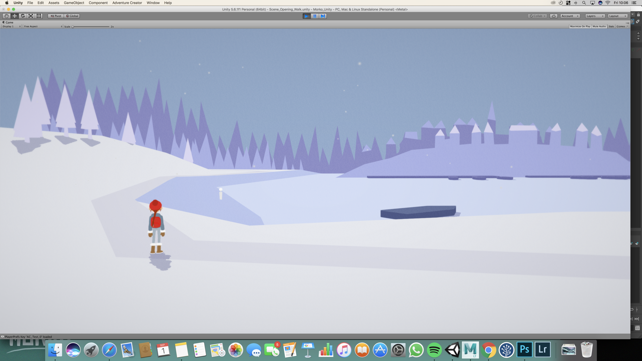
Generally we aim to do all of the above in as short a time as possible with a period of self review, before sharing with the rest of the team for feedback and further iteration. When everyone is happy we’ll push forward with proper art, which means something like this:
Turns into this:
Pretty cool huh?!
OK, that’s it for this week. Until next time!
Tom & Alex


